Look at the text below. In 25 seconds, please speak into the microphone and describe in detail what the graph showing. You will have 40 seconds to give your response.

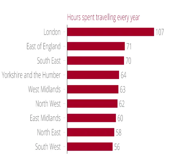
The given graph shows the information about hours spent on travelling every year. According to the image, London’s workers spend 107 hours every year travelling. The East of England, which suffers the second-worst commute with just 71 hours of commuting every year. On the other hand, South West’s workers spend the least number of hours travelling every year, which represents 56 hours. Overall, this images shows the crucial information about hours spent on travelling every year, which is strongly supported by data and facts.
« Previous 1 2 3 4 5 6 7 8 9 10 11 12 13 14 15 16 17 18 19 20 Next »
