Look at the text below. In 25 seconds, please speak into the microphone and describe in detail what the graph showing. You will have 40 seconds to give your response.
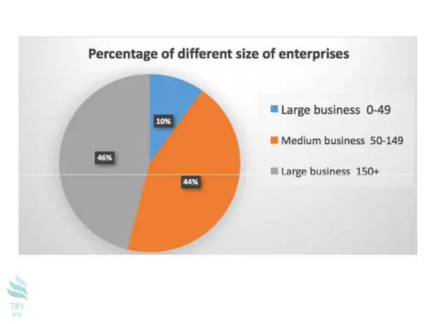
This pie chart shows the percentage of different sized enterprises. As we can see from the graph, the largest proportion is given by large businesses comprising of over 150 employees at 46%. This is closely followed by medium businesses with between 50 and 149 workers at 44%. In contrast, the lowest percentage is given by large businesses with 0 to 49 staff at only 10%. In conclusion, it seems that modern enterprises require a considerable number of staff to operate.