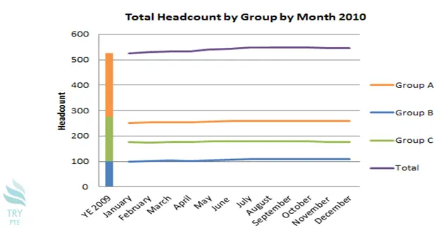
Look at the text below. In 25 seconds, please speak into the microphone and describe in detail what the graph showing. You will have 40 seconds to give your response.

This line chart shows the information about total headcount by group by month 2010. To begin with, we can see that there are several sections in this picture, that is, group A, group B, group C. According to the graph, in terms of group A, the largest number can be found in December which is about 250. The average numbers can be found in group B and group C are 100 and 200 respectively. Last but not the least, in terms of the total number, the average number is about 550. In conclusion, I think it is beneficial because it tells me a total headcount by group by month in 2010 from January to December.
« Previous 141 142 143 144 145 146 147 148 149 150 151 152 153 154 155 156 157 158 159 160 Next»
