Look at the text below. In 25 seconds, please speak into the microphone and describe in detail what the graph showing. You will have 40 seconds to give your response.
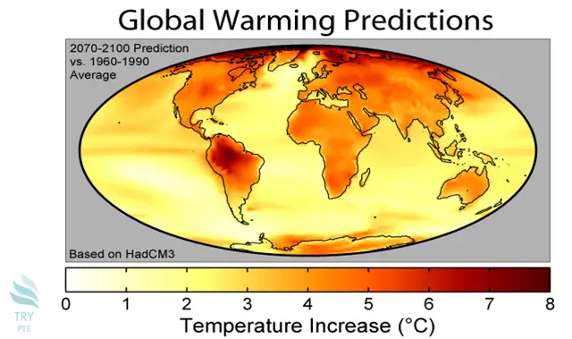
This map shows the information about global warming predictions 2070-2100 prediction vs 1960-1990 average. To begin with, we can see that there is a range of temperature increase in degree Celsius from 0 to 8. According to the graph, most of the continents are represented in red color, which means 5 to 7, especially in the north part of the earth. Last but not the least, most of the ocean is a yellow color, which means the range is from 0 to 3. In conclusion, it is a really useful map of global warming predictions.