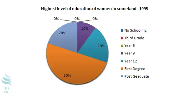
Look at the text below. In 25 seconds, please speak into the microphone and describe in detail what the graph showing. You will have 40 seconds to give your response.

This pie chart shows the information about the highest level of education of women in some land in 1995. To begin with, we can see that there are categories in comparison which are no schooling, third grade, year 6 to 12, first degree and postgraduate. According to the graph, the largest proportion goes to a first degree at 50%, while the smallest proportion goes to year 6, no schooling and third grade at 0%. Last but not the least, for the rest of the categories, the number are ranging from 10% to 20%. In conclusion, this is a very useful graph and it helps to understand the education environment of women.
« Previous 221 222 223 224 225 226 227 228 229 230 231 232 233 234 235 236 237 238 239 240 Next»
