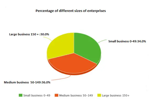
Look at the text below. In 25 seconds, please speak into the microphone and describe in detail what the graph showing. You will have 40 seconds to give your response.

The given pie chart shows the information about the percentage of different sizes of enterprises. According to the given data, medium business with the number of 50-149 contributes the most which accounts for around 36% this is followed by a small business with 0-49, which is 34%. On the other hand, a large business with a number of over 15, contributes the least which makes up 30%. After analyzing the key aspects, it can be concluded that this image shows crucial information about the percentage of different sizes of enterprises which is strongly supported by data and facts.
« Previous 281 282 283 284 285 286 287 288 289 290 291 292 293 294 295 296 297 298 299 300 Next»
