Look at the text below. In 25 seconds, please speak into the microphone and describe in detail what the graph showing. You will have 40 seconds to give your response.
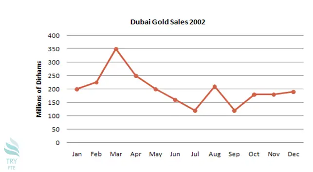
The given line graph shows the information about Dubai gold sales in 2002.To begin with, we can see that the number of sales starts from 200 million of dirhams in January. According to the graph, the sales increased from January and reached the peak in March at 350 million. Last but not the least, it started to decrease after the peak and reached the bottom in July with the figure of 110 million. In conclusion, after July the number of sales fluctuated from July till October and then it tended to be flat.