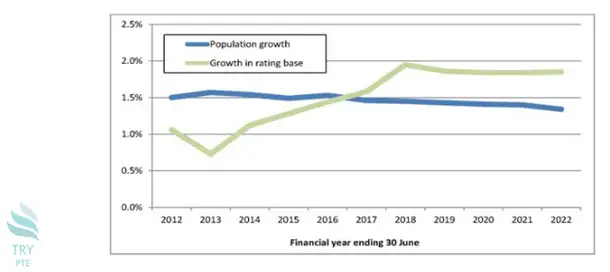
Look at the text below. In 25 seconds, please speak into the microphone and describe in detail what the graph showing. You will have 40 seconds to give your response.

This line chart shows the information about two lines in terms of the financial year ending 30 June and growth rate. To begin with, we can see that there are two sections in this picture, that is, population growth and growth in the rating base. According to the graph, in terms of the blue line, the largest number can be found in 2012 which is about 1.5% while the smallest number can be found in 2022 which is about 1.4%. Last but not the least, in terms of the green line, the largest number can be found in 2018 which is about 2% while the smallest number can be found in 2013 which is about 0.7%. In conclusion, I think it is beneficial because it tells me the relationship between population growth rate and financial year.
« Previous 161 162 163 164 165 166 167 168 169 170 171 172 173 174 175 176 177 178 179 180 Next»
