© 2023 Try PTE | All Right Reserved | Privacy Policy| Disclaimer
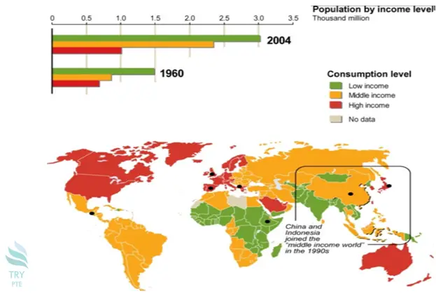
Look at the text below. In 25 seconds, please speak into the microphone and describe in detail what the graph showing. You will have 40 seconds to give your response.

« Previous 201 202 203 204 205 206 207 208 209 210 211 212 213 214 215 216 217 218 219 220 Next»