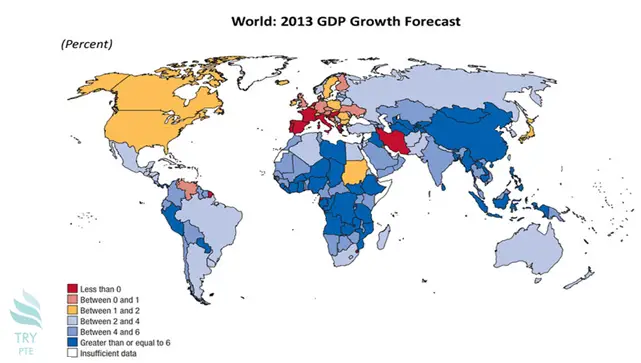
Look at the text below. In 25 seconds, please speak into the microphone and describe in detail what the graph showing. You will have 40 seconds to give your response.

This map shows the information about 2013 GDP growth forecast in money game in the chart of the day in terms of percent. To begin with, we can see that there are several sections in this map, that is, less than 0. between 0-1, between 1-2, between 2-4, between 4-6, greater than or equal to 6 and insufficient data. According to the graph, in Australia, it is covered by the color indicating GDP growth is between 2 and 4%. Last but not the least, in Russia, it is covered by yellow indicating GDP growth is between 1 and 2%. In conclusion, I think this is a very useful graph, and it helps to understand the 2013 GDP growth forecast in the money game in a chart of the day.
« Previous 221 222 223 224 225 226 227 228 229 230 231 232 233 234 235 236 237 238 239 240 Next»
