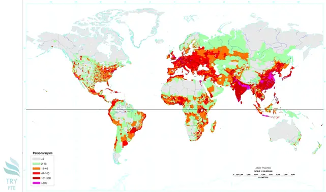
Look at the text below. In 25 seconds, please speak into the microphone and describe in detail what the graph showing. You will have 40 seconds to give your response.

This map shows the information about population density in terms of persons per square kilometres all over the world. To begin with, we can see that there are several sections in this map, that is, under 2 people square kilometres, 2-10, 11-40, 41-100, 101-500 and above 500. According to the graph, in Australia, it is covered by grey colour indicating there are less than 2 people per square kilometres. Last but not the least, in Africa, there are orange and red colours indicating 11-40 and 41-100 respectively. In conclusion, I think this is a very useful graph, and it helps to understand population density all over the world.
« Previous 221 222 223 224 225 226 227 228 229 230 231 232 233 234 235 236 237 238 239 240 Next»
