Look at the text below. In 25 seconds, please speak into the microphone and describe in detail what the graph showing. You will have 40 seconds to give your response.
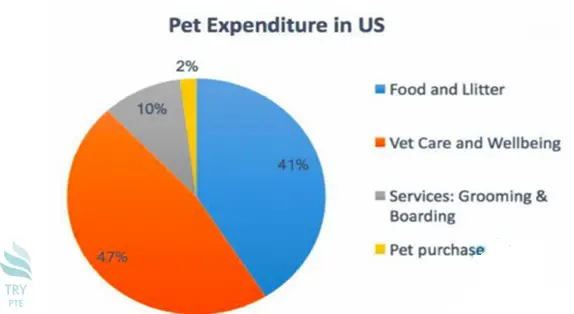
This pie chart shows the information about the pet expenditure in US. To begin with, we can see that there are categories in comparison, which are food and litter, vet care and wellbeing, services: grooming and boarding and pet purchase. According to the graph, the largest figure can be found in vet care and wellbeing, which is 47%. Last but not the least, the smallest figure can be found in pet purchase, which is only 2%. In conclusion, this is a useful chart about the pet expenditure in US.