© 2023 Try PTE | All Right Reserved | Privacy Policy| Disclaimer
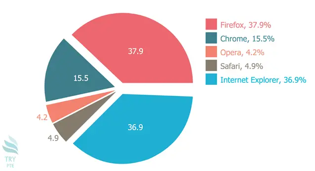
Look at the text below. In 25 seconds, please speak into the microphone and describe in detail what the graph showing. You will have 40 seconds to give your response.

« Previous 41 42 43 44 45 46 47 48 49 50 51 52 53 54 55 56 57 58 59 60 Next »