Look at the text below. In 25 seconds, please speak into the microphone and describe in detail what the graph showing. You will have 40 seconds to give your response.
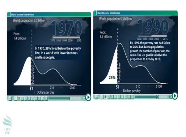
These line graphs compare world income distribution for 1970 and 1990, highlighting the percentage of people earning below the poverty line. During this 20-year period, the number of poor people remained steady at 1.4 billion, however, due to population growth, the actual percentage of the population living in poverty dropped from 38 to 26%. The graphs indicate that in 1990, the majority of the world’s 5.3 billion people were earning less than ten dollars per day. The United Nation’s goal is to reduce poverty to just 13% by the year 2015.