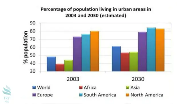
Look at the text below. In 25 seconds, please speak into the microphone and describe in detail what the graph showing. You will have 40 seconds to give your response.

This bar chart shows the information about the percentage of population living in urban areas in 2003 and 2030.To begin with, we can see that there are 6 areas in comparison, which are a world, Africa, Asia, Europe, South America and North America. According to this graph, in 2003, the highest number goes to North America with a figure of 80%, while the lowest number goes to Africa at 38%. Last but not the least, in 2030, the highest number goes to South America with a figure of 83%.In conclusion, the percentages of population living in urban areas of African people and Asian people are below the world average level.
« Previous 81 82 83 84 85 86 87 88 89 90 91 92 93 94 95 96 97 98 99 100 Next »
