Look at the text below. In 25 seconds, please speak into the microphone and describe in detail what the graph showing. You will have 40 seconds to give your response.
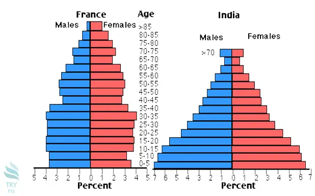
The given bar chart represents the information about population distribution in different age groups in France and India.To begin with, we can see that in France there are more females than males, especially for elder age group people. According to this graph, there is an equal population of males and females in India. Last but not the least, the aging society problem in France is worse than in India. In conclusion, the population distribution in France is quite even for different age group, while there more newborn than the elder people.